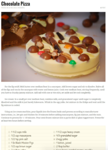
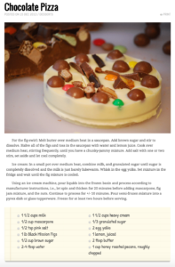
As a one-day lab in 201, we were given an image of a website and told to go make a design comp in teams of two; basically a day of pair programming. It made me think our instructor really has a pizza thing considering after pizza 3001 we went right into a chocolate pizza design comp. Our task was to replicate an image of a website as best we could. That turned out to be “pretty well” in my opinion!
This was a pair programming exercise; I was paired with someone who wasn’t as familiar with CSS as I was – but one of the things I like most about pair programming as opposed to “group work” or “pair work” that I’ve done previously – in academia, say – is that the end result is for both of us to produce good work. The driver/navigator roles helped keep us both engaged – and made sure that both of us knew what we were doing. And of course, no matter how good someone is, they can’t know everything – there were situations where I knew a CSS attribute which was new to my partner (text-transform: uppercase;) and there were situations when they thought of a solution which was eluding me (“try a negative margin of 16px”) – end result? A much cleaner, better solution because we collaborated – you can tell I like pair programming, yes?
Featurewise, what I’m most proud of was how we managed to get the checkbox behavior implied from the spec working with pure CSS – I was pretty confident this was possible without javascript and after we got the comp in shape, went for it. CSS Tricks provided the answer. By using the :checked psuedoselector and making our list consist of checkbox inputs, we could duplicate the checkbox functionality without a single line of javascript. An example list item would look like this:
<li><input type="checkbox" id="cb1" value="0"></input><label for="cb1">1 1/2 cups milk</label></li>
And the CSS which controls the checkbox behavior:
input[type=checkbox] + label {

text-decoration: none;

}

input[type=checkbox]:checked + label {

text-decoration: line-through;

}
End result? The list item is checked off when you check the box, providing an intuitive “checkbox” behavior for a list of ingredients. It wasn’t really “essential” for a visual comp – but I think it speaks well that we had the capacity to look at an image and ask ourselves “so how does this function” and replicate it, even though we could’ve just used line-through on two lines on our list.

