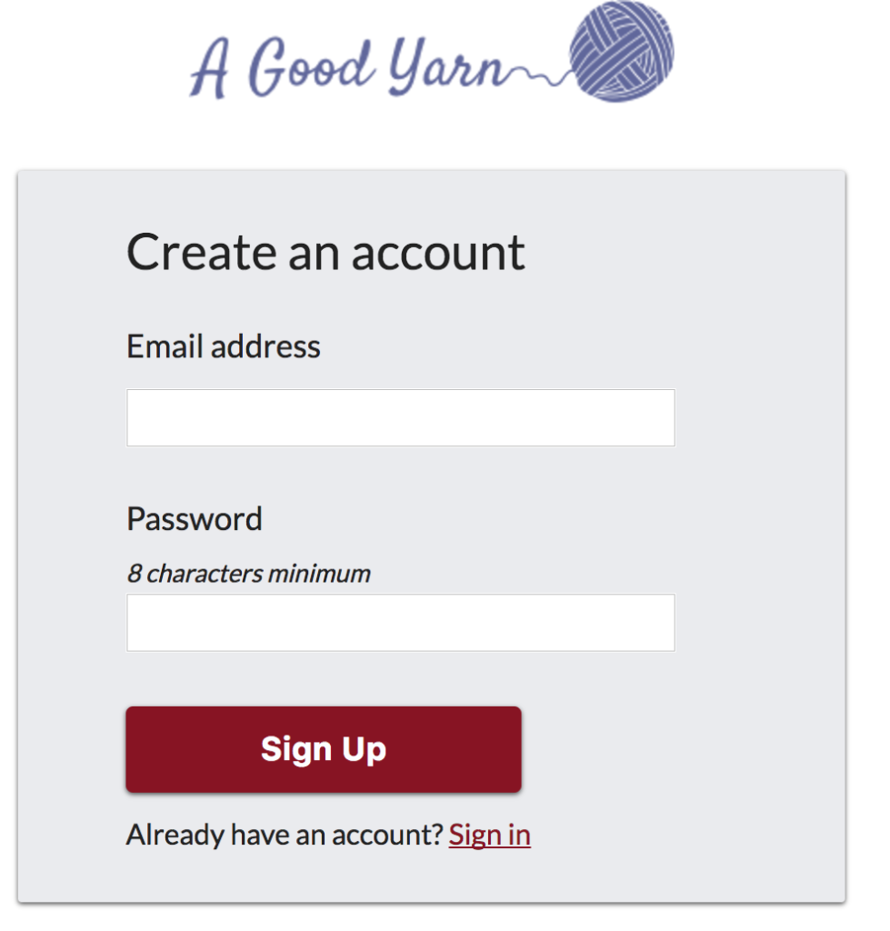
Lorelei found a UI challenge site, DailyUI, and wanted to work on several of these with me – for her, practice using Sketch instead of InDesign. For me, an opportunity to learn some new tricks and work on developing a design made by a real designer! And, as it turned out, quite a bit about validating email addresses.
The first design she created was a login page. I developed it based on a provided comp and the finished product is here: https://peterbreen.github.io/ui_challenge/01/index.html. The repo is available, as usual, on my Github.

Given that it passed muster from the designer I’m gonna go ahead and call it MVP, shippable, etc, etc 😉
I decided to use CSS Grid for this and for every one of these challenges; I want to learn and get more practice using Grid. In this case it’s a grid of one, so it’s not too different from just setting margin: 0 auto; but that’s fine. As an introduction to grid, it worked fine.
For learning Grid, I went to CSS Tricks first thing, and lived off their guide, written by Chris House. I also found MDN’s Grid page and Rachel Andrew’s excellent Grid By Example to be excellent resources. Grid By Example, in particular, was invaluable in showing how to move from “here’s how the spec works” to “here’s a real example using it.” Great site, highly recommended.
I set the page up with a CSS reset and SASS as is my preference and put in some basic folder structure for future expansion – I know I’ll be making more of these so modularity was on my mind, but I also know refactoring is valuable practice so I expect there will be changes in structure as well as content as we make more and that’s okay – it’ll make sure I know my code, at the very least!
Aside from the HTML and CSS – which was pretty straightforward, I did a little basic clientside as-you-type validation of the input fields. I saw no need to load jquery or any other library for something this simple so I just wrote some vanilla JS functions to handle it. As-you-type validation is, in my view, a really useful UI pointer and makes for a much, much better user experience. Forms need all the help they can get in this regard.
Specifically, the password field will validate when you meet the minimum length of 8 characters and the email field uses a basic regular expression to validate that you have something which at least resembles an email address. I say ‘resembles’ because in researching email validation, I found a wealth of discussion and debate on the issue (see a pretty good Stackoverflow conversation, for example) …the end result being, basically, you can’t validate 100% correct email addresses without actually sending them an email, so just try to filter out the most obviously incorrect ones first, send an email to actually validate it second.
After all, validation is not just “is this email address valid” but “is it your email address?” …and considering how many emails I get meant for people with my first initial and last name, I’d say a lot of websites have not been developed with the second question in mind!
It’s a valuable lesson – you can (or more accurately, should) only do so much clientside and you also have to make sure you’re asking the right questions. As one site I read put it, there’s a trade-off between being exact and being practical. If the only practical way to validate an email is to send one, send one. Don’t force the browser to run complex (which is to say, fragile) code that may technically validate an address without practically validating it.
On to the second! Lorelei’s work schedule means we’re not doing these literally daily, but we’ll be doing more.