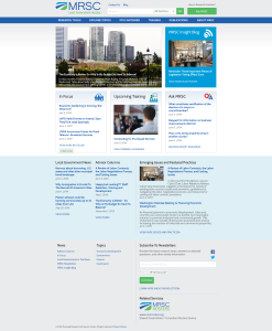
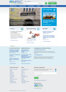
In late 2014, I went into a … well, not crunch, but let’s say an extended period of head-down development and content migration for a much-needed new website redesign at my employer. My organization started the website redesign project in July 2013 and we launched a new one on January 23, 2015. Switching the A-record that afternoon was one exciting moment … mostly because we weren’t sure the website was going to work.
That’s always comforting, right?
I wanted to write this retrospective because I just closed out the last major ticket for the project – the timing is good.
To begin with, my organization is by no means unique but let me sum up with “small non-profit” – this is where heads start to nod when I talk about this with my peers – but specifically, the challenges we faced for our redesign included:
- Our old website was homegrown, and mostly static HTML or homegrown SQL database-driven at that; file organization was a Windows folder structure – unsurprisingly, we wanted a proper content management system.
- The webserver was in our server rack – we wanted it hosted externally.
- The website’s style was last comprehensively redesigned in 2004 or so – we wanted to join the 21st century. (Imagine me saying “Responsive design!” about twice a meeting)
- We had a blog hosted on WordPress – we wanted to pull that into our new CMS
- Our website was very large for our organization size; low four digit pagecount for 26 people
- We decided to reorganize the content structure while we were at it.
- And everyone wanted new features! New stuff. New everything. Which means a new workflow, new process, and … yeah.
…Long story short, we didn’t know what we were getting into. But who does? On the other hand, I think we learned some valuable lessons; we did some things right and some things wrong. Here’s four things I took away from the process.
Have clear decisionmaking authority
- The committee’s role as advisory was never fully internalized by some of its members, and never corrected by their managers – in some cases, their managers were trying to exert decisionmaking authority along with them!
- It was too big – too many voices. The group size basically threw grit into the entire process from start to finish.
On the other hand, the large cross-section of staff involved helped tremendously with staff buy-in and a better understanding of how our customers engage with our website, and maybe a better appreciation for the web design process. It still wasn’t worth the excess friction, but it was something.
Avoid scope creep
Stick to your decisions
Have realistic timelines
Where we hit the real brick wall was content migration. For budgetary reasons, content migration was going to be “our contracted firm automates what they can and we do the rest in-house,” but the bulk of that task fell on a small number of people already doing full time work and it was not properly budgeted for in terms of time. Every skeleton in every closet of that website came back during the migration … and you can imagine how many skeletons were in over a thousand hand-made pages, some of which were the direct descendents of pages created in 1996. Our management had no idea how difficult content migration would be, they kept thinking it should take “no time at all,” and they didn’t understand what we were telling them – that every single nonstandard HTML choice or slightly different method of CSS or every “I’ll do a quick fix for this” change had to be dealt with, that it was going to take a long time, and that even the automated content migration (e.g. WordPress XML export to our new CMS blog module) was only ever going to get 80% of the job done. They didn’t know this going in they just kept seeing the launch date get pushed further and further back and eventually, just lost their nerve, patience, or both.
In my initial list above, I listed all the things we wanted to accomplish with this redesign. It’s awfully tempting to just sweep the board and make every change you can think of – but come launch day, when you have a new CMS that’s still not familiar to you, content that’s not finished, workflows that are untested, a new web host that’s not a known quantity, and a clock ticking down to five thousand visitors on Monday? Well.
We got lucky – things held together just enough that first week for us to fix the critical problems as fast as we and our developers could identify and fix them. I won’t say it was perfect, it wasn’t, but at the end of the day we succeeded more than we failed. And that’s pretty good.

